Fanclash

ROLE
UX Research Prototyping Usability Testing A/B Testing
TEAM
PM, Data Scientist, Creative Lead
DURATION
90-day design sprint — 2023

Fanclash is a fantasy eSports app where users build teams of real players, enter paid tournaments, and earn rewards based on live match performance. Users loved the free trial but abandoned when real money was involved. I redesigned the team creation flow and ran A/B tests that increased payment conversion by 11%.

View Impact
CONTEXT

Participation Dropped After the First Tournament

Users eagerly joined their first tournament using promo coins. But when real money was involved, they disappeared.

USERS PAYMENT TOURNAMENT FUNNEL 4 of 5 bounced

Returning users entered the funnel but bounced before payment

RESEARCH

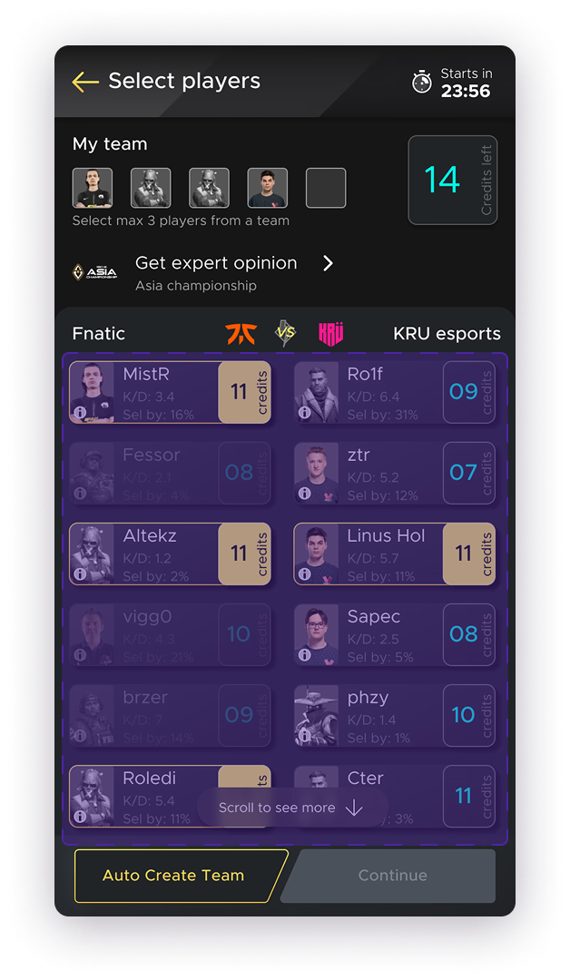
Something in Team Creation Was Confusing Users

87% of users reached the Create Team page, but only 19% moved forward to payment — a 68-point drop at a single screen.

100% 75% 50% 25% 0% 68% drop here Browse 100% Choose Match ~90% Create Team ~19% Choose Captain ~15% Pay & Confirm ~19% 100% 90% 19%

How I Investigated

I combined three research methods to understand what was happening and why.

Heatmap Analysis

Mapped tap density across the Create Team screen. Revealed where users were tapping — and where the UI wasn’t responding.

Session Recordings

Watched real user sessions frame by frame. Identified repeated patterns of confusion and rage-tapping on disabled elements.

Follow-up Interviews

Spoke directly with users who abandoned. Their frustration pointed to the same invisible rule every time.

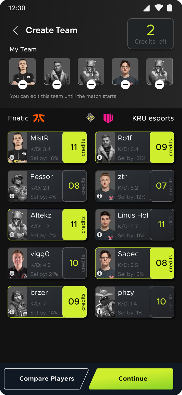
Heatmaps and session recordings showed where the confusion happened. Users were tapping disabled player cards repeatedly, checking stats pages for answers, and scrolling without finding the rule.

Heatmap: taps concentrated on disabled players
Session: user checking player stats for clues
Heatmap: repeated taps with no feedback
Session: user scrolling without finding the rule

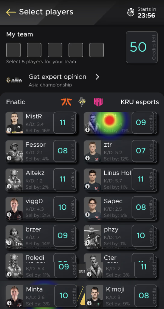
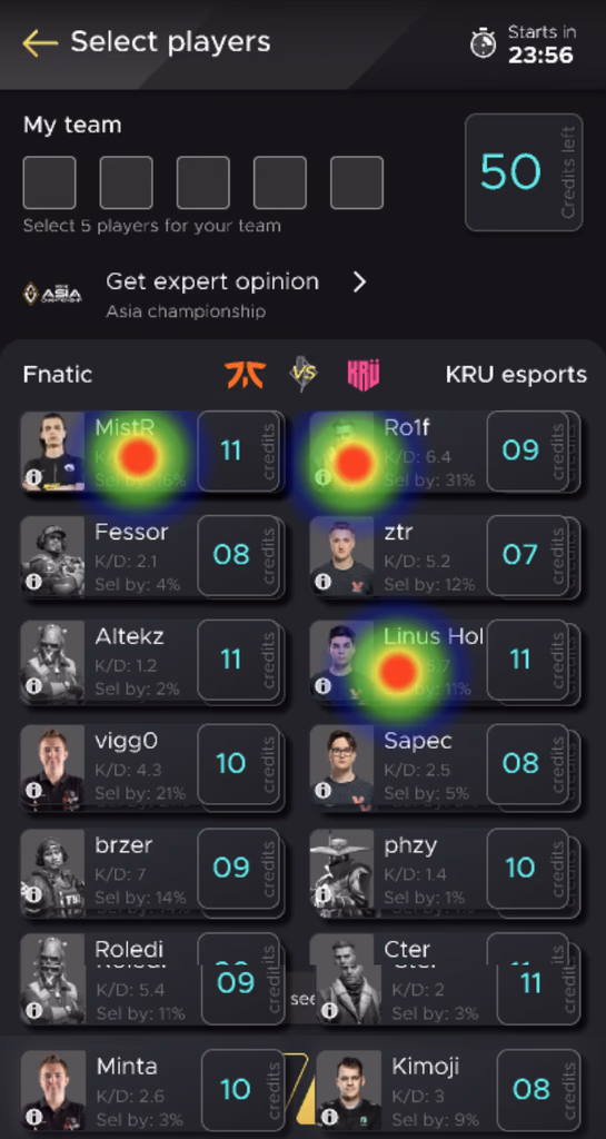
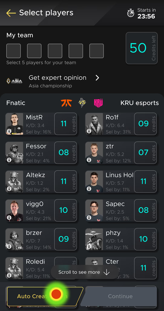
Heatmaps and session recordings from the original Create Team screen

28%
Misclick
rate
33.4s
Avg
duration
28%
Avg
success
30%
Avg
bounce
Root cause: Users couldn’t select more than 3 players per team from the same eSports organization — but the rule was invisible. Players appeared disabled with no explanation. Users kept tapping, got no feedback, and left.
DESIGN DECISIONS

Making the Rules Visible

I explored 4 directions to fix the team creation flow. Each tackled a different hypothesis about why users were dropping off.

Exploration 1

Rebranded System

Better colors/contrast but didn’t fix the core rule visibility problem

Exploration 2

Team Near CTA

Moved My Team closer but grid layout still overwhelmed users

Exploration 3

60-30-10 Color

Improved hierarchy but users still couldn’t find the selection rule

Exploration 4 — shipped

Single Column (shipped)

Reduced cognitive load AND made rules visible inline. Combined best of all 3.

Conclusion

The single-column layout (V4) was the clear winner. It reduced cognitive load enough that the selection rules became visible naturally. I then refined it by pulling in the improved color hierarchy from V3 and the repositioned team section from V2. Usability testing confirmed this direction fixed the comprehension gap.

What I Changed

Single-Column View

Replaced the cluttered grid with a scannable single-column layout. Reduced cognitive load.

Team Counter

Added a visible counter showing selected players and remaining slots. Made progress tangible.

Visible Selection Rules

Surfaced the 3-player-per-team rule directly in the UI with contextual messaging on disabled states.

My Team Repositioned

Moved the “My Team” section closer to the CTA. Reduced the distance between selection and action.

Expert Opinion

Made the Expert Opinion feature prominent. Gave uncertain users a starting point for team creation.

60-30-10 Color Rule

Applied the 60-30-10 color ratio to guide visual hierarchy. Primary actions became unmissable.

THE REDESIGN

Before and After

The redesign wasn’t about adding features. It was about making existing game rules visible in the interface.

Original: cluttered grid, invisible 3-player rule, no team counter

Before

Redesigned: single-column, visible rules, team counter, Expert Opinion

After

BEFORE

Grid layout with all players visible at once. No team counter. Disabled players had no explanation. The 3-player rule was completely hidden. Users thought the app was broken.

AFTER

Single-column layout with clear team counter at top. Selection rules visible inline. Disabled states explained with contextual messages. Expert Opinion feature prominent for new users.

TESTING

Validating with A/B Tests

Usability testing narrowed to one variant. Then A/B tested with Clevertap.

80% 60% 40% 20% 0% 56.6% 67.8% 5s 10s 15s 30s 1min 2min 5min 10min Variant A (Control) Variant B (Redesign)
Key Decision

56% → 67%. In a pay-to-play model, that 11% directly impacts revenue.

IMPACT

11% More Users Reached Payment

+11%
Payment
conversion
+21%
Team completion
rate
+19%
Expert opinion
engagement
+28%
Player stats
engagement
100% 75% 50% 25% 0% +21% Browse Choose Match Create Team Choose Captain Pay & Confirm Before After

11% increase in Payment flow is a big achievement in a Pay to Play model.

— PM, Fanclash
MY ROLE

UX Researcher & Designer

I led the research, design, and testing across the full 90-day sprint. Every decision was grounded in data and validated through testing.

What I Owned

  • Funnel analysis — identified the 87→19% drop-off point
  • Heatmap analysis and session recording review
  • Follow-up interviews with churned users
  • Design explorations and prototyping
  • Usability testing on redesigned flows
  • A/B test design and results analysis
  • Visual design system refinements (60-30-10, typography, color)

The Team

  • PM — Requirements, sprint planning, stakeholder alignment
  • Data Scientist — Analytics pipeline, Clevertap tracking, A/B test infrastructure
  • Creative Lead — Visual direction, brand consistency, design review
REFLECTION

What I Learned

Ninety days on a conversion problem taught me two things I carry into every project.

Data finds the problem. Interviews explain why.

Analytics showed the 87→19% drop. That told me where the problem was, not what caused it. Heatmaps showed frustrated tapping. Session recordings showed repeated patterns. But only interviews revealed the invisible 3-player rule. Quantitative data is a compass. Qualitative research is the map.

Good design is invisible rules made visible.

The fix wasn’t adding features — it was making existing game rules visible in the UI. The constraint existed for a reason. Users just couldn’t see it. The best design work I did on this project was removing confusion, not adding functionality. When the rules became clear, the users moved forward on their own.